Want to learn how to create a high converting squeeze page that converts visitors into leads effortlessly?
If so you’re definitely in the right place!
Creating a squeeze page that converts visitors to leads at a high percent will give you the ability to acquire leads at a good cost.
Being able to acquire leads at a good price is how you build a successful online business.
In this post I would like to talk about what a squeeze page is,the purpose of creating one and 3 tips to help you improve conversions with your squeeze pages.
What is a squeeze page?
A squeeze page is a type of landing page used to generate leads for your online business.
The sole purpose of a squeeze page is to convert your visitor to a lead and get them to the next step of your funnel.
Here are 3 tips to help you improve conversion rates on your squeeze page
Tip #1 – Write a benefit driven headline

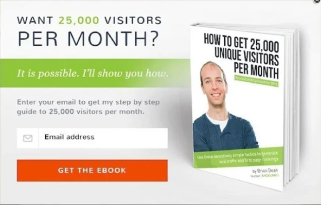
Backlinko’s “Want 25,000 Visitors Per Month?” headline above is a perfect example of a benefit driven headline.
The big benefit is getting a ton of traffic to your website every month.
Remember that people are always thinking about what’s in it for them
A benefit driven headline should let you know right away what’s in it for you and what you will get.
Tip #2 – Create curiosity

Russell’s headline “My Weird Niche Funnel That’s Currently Making Me $17,947 PER DAY!” invokes tons of curiosity.
A lot of people will look at that headline and want to know more about this weird niche funnel that’s making Russell a lot of money.
Of course the only way people can learn more about this weird niche funnel is to register for the webinar and attend it!
Tip # 3 – Only ask for their email
To reduce friction and make it as easy as possible for your visitors to optin to your squeeze page only ask for their email!
The #1 goal of a squeeze page is to capture the visitors email address.
In most cases,the more form fields you have on your squeeze page the lower the conversion rate.
Well there you go. Keep these 3 tips in mind when designing your next squeeze page.
Have any tips I haven’t mentioned in this post?
Let us know in the comments section below!


